How to refine your website with an AI agent
Read your look off the positioning you already wrote, then run the review loop: giving the agent eyes so it can see the page, motion with restraint, and mobile.
The first pass is never the finished site, and it was never going to be. What separates a site that looks thrown together from one that looks deliberate is the loop that comes after. You look at it, you say what is off, the agent changes it, and you look again.
Last lesson settled what the pages say. This one is about how they look. You are not going to write any CSS; you say what is off in the same words you would use with a designer.
Right now the agent is building a page it has never seen, and one piece of setup later in this lesson fixes that. As before, we work on the demo site and you follow along on yours.
Where your site’s look comes from
The reflex is to start with colors you like. Skip it. You already did the work that settles most of this, and it is sitting in your folder.
Positioning is a design brief in disguise. Who this is for, what you want them to think, what you are deliberately not. Those answers rule out more visual choices than any preference will, and they are the reason two sites in the same field should not look alike.
Four decisions carry almost all of it.
Color
- One accent is enough. Take it from somewhere real: your own photography, or your field’s conventions, joined or defied on purpose. Never a palette generator. A generated palette is a default.
Type
- A pairing, one job each: character for the headlines, quiet for the body. A single typeface doing every job is the most common tell there is.
Photographs
- Yours. You put them in the folder last lesson, so use them. A real photograph beats any amount of styling, and stock reads as a placeholder nobody replaced.
Density
- Space speaks before anyone reads a word. Tight reads technical, air reads expensive. Neither is better. Pick one on purpose instead of inheriting whatever the agent reached for.
Those four are decisions only you can make, and reference makes them easier to make well. Spend twenty minutes looking before you brief anything.
Where to look for design reference
Design reference comes in three kinds, and knowing which one you are looking at decides what you can safely take from it.
Concept work is Dribbble and Behance territory: shots that were mostly never built. Use them to work out what you like the feel of, a color pairing, a type combination, how much space to leave. Do not take layout from them. Nothing in those images had to carry real content, load on a phone, or survive a paragraph that ran long.
Shipped sites are the better read for structure. Godly and SiteInspire collect real ones, Land-book does the same for landing pages, and Awwwards aims at the spectacular, so read that one as ambition rather than instruction.
Template galleries are the kind almost nobody thinks to use this way, and I have always found them the most useful of the three. Webflow and Framer publish thousands of templates, each one a complete site built for a job: a portfolio, a studio, a person. Browse the category your site belongs to and you see, over and over, what a finished site of your kind includes and in what order. You are not going to rent one, so treat the catalog as free structural research from the builders you are not paying.
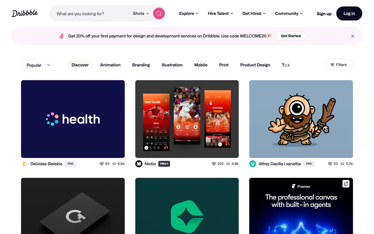 DribbbleConcept work, for feeldribbble.com
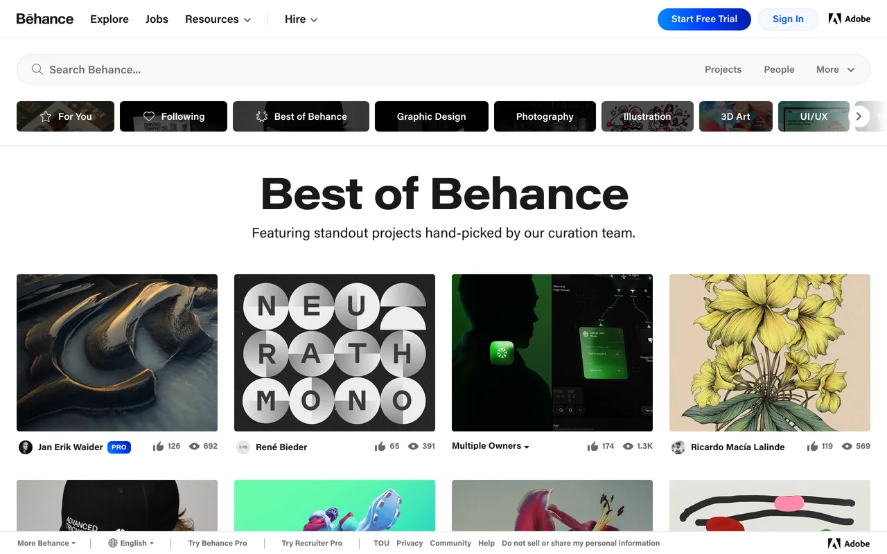 BehanceConcept work, for feelbehance.net
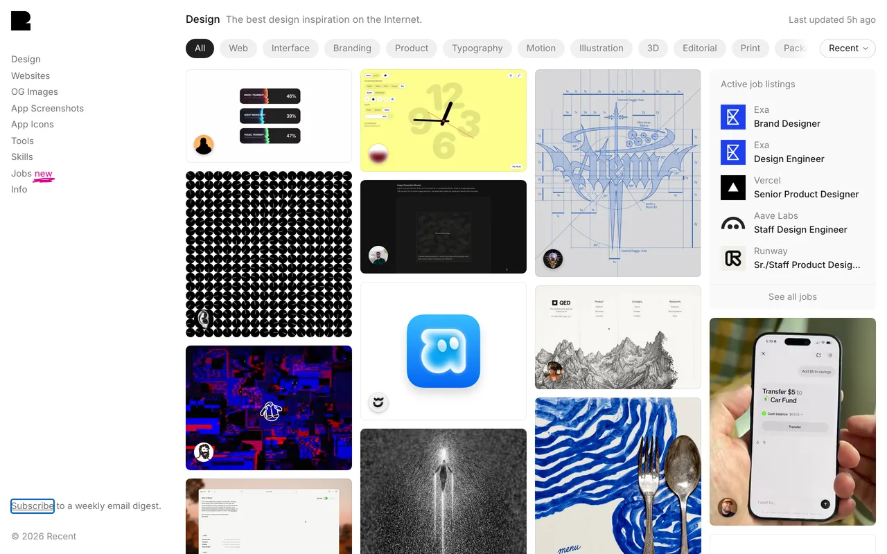 GodlyShipped sites, for structuregodly.website
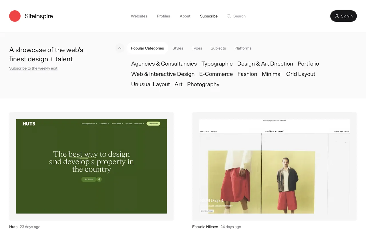 SiteInspireShipped sites, for structuresiteinspire.com
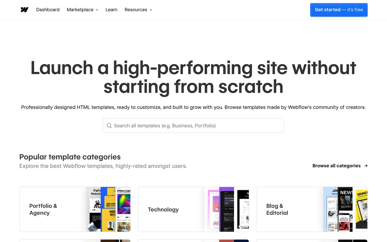 Webflow TemplatesComplete sites, by jobwebflow.com/templates
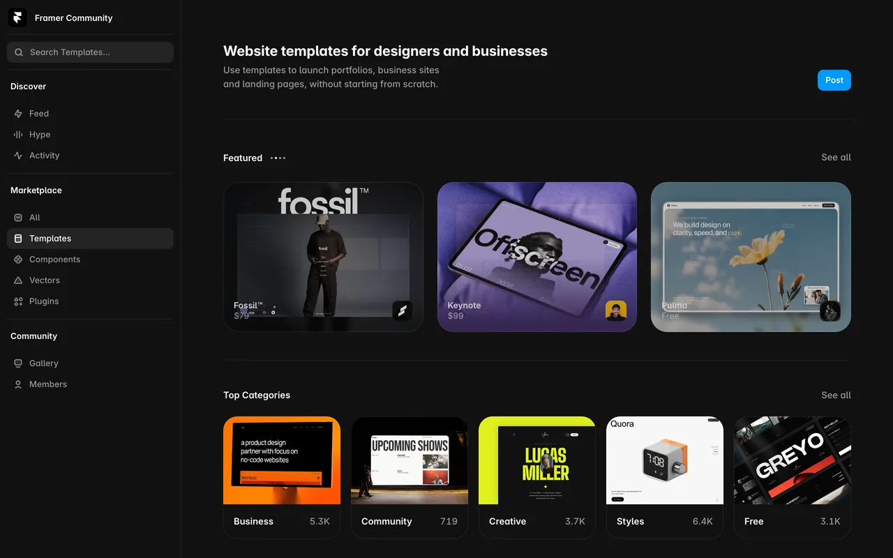 Framer TemplatesComplete sites, by jobframer.com/templates
None of them beats the sites you gathered last lesson: people doing your job well, solving your problem rather than winning a prize.
Assignment: brief the agent on a visual direction
This hands over your positioning, your photos, and whatever the reference browsing left you with, and asks for two directions back, every choice traced to your own material.
Read my context file, especially its positioning and voice sections, then look at the photographs in the folder. Based on those, propose a visual direction for the site: one accent color, a typeface pairing with a job for each, and how dense or airy the layout should be. If I paste links to sites I liked while browsing reference, treat them as taste to learn from, not layouts to copy. For every choice, tell me which line of my positioning it came from. Give me two different directions to choose between, and do not change any code yet.
Ask for two directions rather than one. Choosing between options is much easier than judging a single proposal, and the one you reject usually tells you what you actually wanted.
The review loop, in plain English
The instinct, when something looks wrong, is to reach for technical language you do not have. Resist it. “Increase the line height to 1.6 and add 48 pixels of padding” is a worse instruction than “this text feels cramped”. The second one describes the problem and leaves the solution open.
The agent can already write the CSS. What it cannot do is decide, and deciding is the part you are good at. Your job is art direction.
“Make the headline sharper.” “This section feels heavy.” “The gap between these two blocks is doing nothing.” All of those get you further than a list of measurements.
When you cannot name what is wrong, say that too. “Something about this page feels cluttered and I am not sure why” is a genuinely useful instruction. The agent can look at the structure and offer three reasons it might be, and you pick the one that sounds right.
Assignment: get a ranked review of the home page
Run the loop you just read about on your own home page. Plain language back, ranked by impact, nothing changed yet.
Look at the home page and tell me what you would change about the way it looks, ranked by how much difference it would make. Do not change anything yet. For each one, tell me what is wrong and what you would do instead, in plain language rather than CSS.
Change one thing at a time and look after each. If you hand over ten instructions at once and the page comes back worse, you have no idea which of the ten did it. Small steps feel slower and are not.
Look intentional, not like a template
Sites built quickly with an agent have a family resemblance, and people have learned to spot it.
The strongest signal is sameness. Research on this is consistent: when people say a page looks generated, they are almost never reacting to one element. They are reacting to a page where every choice was the default choice, and so it looks like every other page where every choice was the default choice.
The fix is a single idea rather than a checklist. Every default you accept is a decision somebody else made, usually the person who wrote the library. Replace the defaults that carry meaning with choices that come from you: your colors, your typeface pairing, your photograph, the layout your content actually needs.
A few patterns still show up often enough to name:
- A small uppercase label sitting above a heading, saying something like “OUR SERVICES”
- A row of exactly three cards, each with a little icon at the top
- Cards nested inside other cards, so nothing is emphasized because everything is
- The tip box with a colored bar down its left edge
- One typeface doing every job on the page, at three sizes
- The indigo to violet gradient that arrives free with several popular toolkits
None of those is a crime on its own. All six together is the look people mean.
Now the part most advice gets wrong. Dark backgrounds, bento grids, glassmorphism and mesh gradients get named as tells constantly. When researchers tested them against what people actually flag, they came out near the bottom or were rejected outright. This site is dark on purpose. Do not strip something you like because a list told you it was a tell.
Assignment: hunt down the defaults
This sweeps the site for choices that are defaults rather than decisions, and proposes replacements drawn from your own material.
Review the site for design choices that look like defaults rather than decisions: generic labels above headings, rows of identical cards, cards inside cards, a single typeface doing every job, stock gradients. For each one, suggest a replacement that comes from my own material, my colors, my photos, my actual content. Show me the list before changing anything.
Give the agent eyes
Everything so far has one hole: the agent has been writing a page it cannot see. It knows what the code says and infers what that code looks like, roughly the way an architect describes a house from the blueprint. Most of the time the inference is fine. When it is not, you end up in a loop where you say “the header is broken” and it says “I have fixed the header” and it is still broken.
You met the fix in Foundations without installing one: connectors, the ready-made way to plug an agent into something outside itself. This is the first one the course has you add, and it is the one I would keep if I could only keep one.
- Chrome DevTools connector
- A connector that lets the agent drive a real Chrome browser. The agent can open your site, screenshot it, resize to a phone width, read the errors in the console, and run performance checks. “I think this looks right” becomes “I looked at it”.
The exact steps differ depending on which tool you picked back in Foundations, so hand the job to the agent. This one is published openly by the Chrome DevTools team, so there is nothing to download or sign up for.
Assignment: install the Chrome DevTools connector
Likely your first connector, and the agent handles the install. The three gotchas below are worth reading while it runs.
Install the Chrome DevTools MCP connector, the official one published by the Chrome DevTools team, into the agent tool I am using right now. Set it up at user scope so it is available in every project rather than only this one. When you are done, tell me what you changed and whether I need to restart the session before the new tools show up.
If you want to see the full list of what it can do, the project page is worth a glance. Three things will trip you up, and all three are quick:
- Restart after installing. Connectors load when your session starts, so one added halfway through will not appear until you close the session and open it again. This is the single most common “I installed it and nothing happened”, and it is not you.
- You need Chrome on the machine. The connector drives Chrome specifically. If you are a Safari or Firefox household, install Chrome first and leave it alone otherwise.
- It opens its own browser window. A fresh Chrome window appears, separate from your everyday one, with none of your tabs or logins in it. That is expected. It is the agent’s window, not yours.
Once it is running, the agent can check its own work before handing it back.
Assignment: give the agent its first look at the site
The first prompt where the agent uses its own eyes: screenshot, look, report, then the same page again at phone width.
Open the site in the browser, take a screenshot of the home page, and look at it. Tell me what is visually wrong or awkward: spacing, alignment, anything that overlaps or sits oddly. Then check the same page at a phone width and tell me what breaks. Report first, change nothing yet.
Treat what comes back as a second opinion rather than a verdict. It is good at catching things that are mechanically broken, an element overlapping another or text running off the edge. Whether the page looks good is still your call.
Motion, if you want it
Agents are genuinely good at motion. Fades as you scroll, a subtle lift on hover, elements arriving in sequence: ask and you will get a competent version on the first try. Building it is not the skill.
Knowing when to stop is the skill. Animation is one of the few things you can add to a page that makes it measurably slower. Slower is a number you get graded on in the next two lessons, and a quiet site that scores well beats a swooping one that does not.
My rule is that motion should do a job. Showing that something arrived, drawing the eye to the one thing that matters on the page, softening a change of state so it does not jump. If the only reason for an animation is to be impressive, cut it. Nobody has ever come back to a personal site for the scroll effects.
On the home page of this site there is a grid of hexagons, and hovering one pops up a small label. The pop lasts a fraction of a second, and its only purpose is to tell you which hexagon the label belongs to. The animation also switches itself off for anyone whose system asks for less of it.
Expect more back and forth here than anywhere else in this lesson. Motion is hard to describe in words, and “a bit less” is a legitimate instruction you may need to give three times before it feels right.
Assignment: add restrained motion
Optional. The last line asks what the motion costs in performance, so the tradeoff surfaces now rather than in the final lesson.
Add restrained motion to the home page: a gentle fade and rise as sections come into view, and a subtle state change on links and buttons. Keep it fast and quiet, nothing bouncing or sliding across the screen. Respect the reduced-motion setting for people who have asked for less animation. Then tell me what it cost in performance terms.
Mobile, and images that stay light
Most people who ever see your site will see it on a phone, and a layout built on a laptop screen tends to fall apart on one. Text that sat in two neat columns stacks into a long ribbon. A photo that anchored the right side pushes everything sideways. The header eats a third of the screen.
Right-click the page, choose Inspect, then drag the edge of the panel that opens until the page beside it is phone-narrow.
That is your mobile layout, live, and it keeps updating as the agent makes changes. Three seconds to set up, nothing to install, and it is the check I run most often of anything in this course.
The demo site at that width:
The agent’s version of the same pass is worth running across every page, because it will not skim.
Assignment: run the phone-width pass
Every page, at phone width, with screenshots. Fixes go one page at a time so you see each before and after.
Check every page at a phone width and take a screenshot of each. Tell me what breaks: text too small to read, anything overflowing sideways, tap targets too close together, images that dominate the screen. Fix them one page at a time and show me the before and after for each.
Then images, which are the usual reason a fast site turns slow. A photo straight off your phone can be several megabytes and four thousand pixels wide, being displayed at six hundred. That difference is invisible on your laptop with good wifi and painful on a phone on mobile data. Astro has an image component that handles this at build time. It resizes each photo to the sizes actually needed and converts it to a lighter, modern format, and your originals stay untouched.
Assignment: switch to optimized images
One instruction moves every photo onto Astro’s image handling, originals untouched, with the weight counted before and after.
Switch the site to Astro’s built-in image handling so every photo is resized and served in a modern format. Use the original files as the source. Tell me the total image weight of the site before and after, and flag any image that is still unusually heavy.
Images and motion account for most of what drags a small site down, and both are easier to get right now than to unpick later.
What you have now
The site looks like a set of decisions rather than a set of defaults. You have a way of talking to the agent about how things look that does not require any technical vocabulary. The agent can open your site, look at it, and check its own work at phone widths before handing it back. Motion, if you wanted any, is doing a job and paying for itself.
One thing is still missing, and it is the part a page builder quietly handled. The contact page cannot take a message yet. Nothing is counting visitors. Paste a link to the site into a chat and no tidy preview appears. Next lesson wires all of that in, and runs a first check that none of it slowed you down.