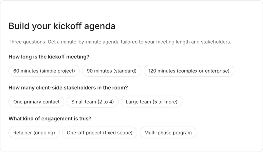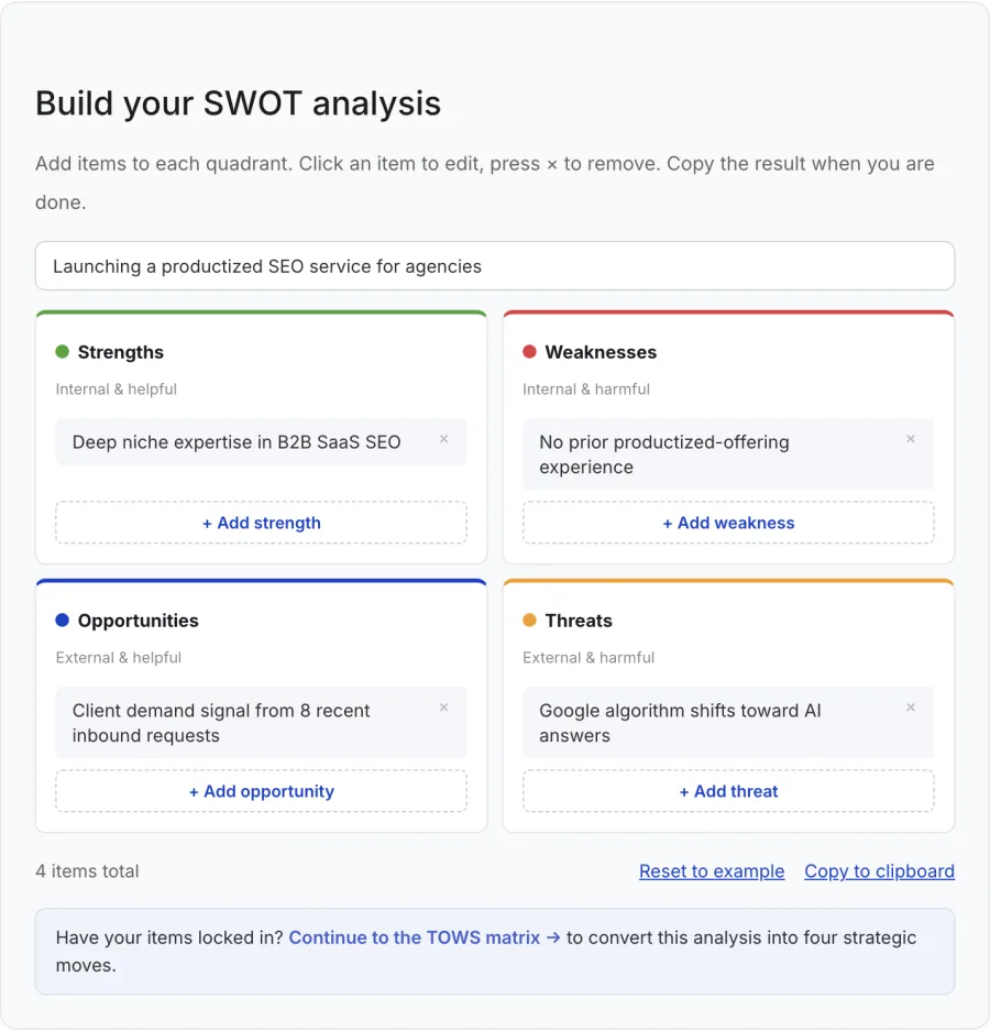
I do not know about you, but I killed a lot of high-school afternoons on BuzzFeed quizzes. Which character are you, which city should you actually live in, the whole genre.
So a few months ago I got inspired, and started building quizzes somewhere few marketers have thought to try them: B2B product shopping.
The route there was unglamorous. Webflow had a custom embed block. Years before any of this involved AI, I used it to paste in CTA blocks, copied from components already on the site. Then I moved to working in an editor with agents, and started wondering how far that slot could go. Custom CTAs, then tables, then a kanban board, then a quiz.
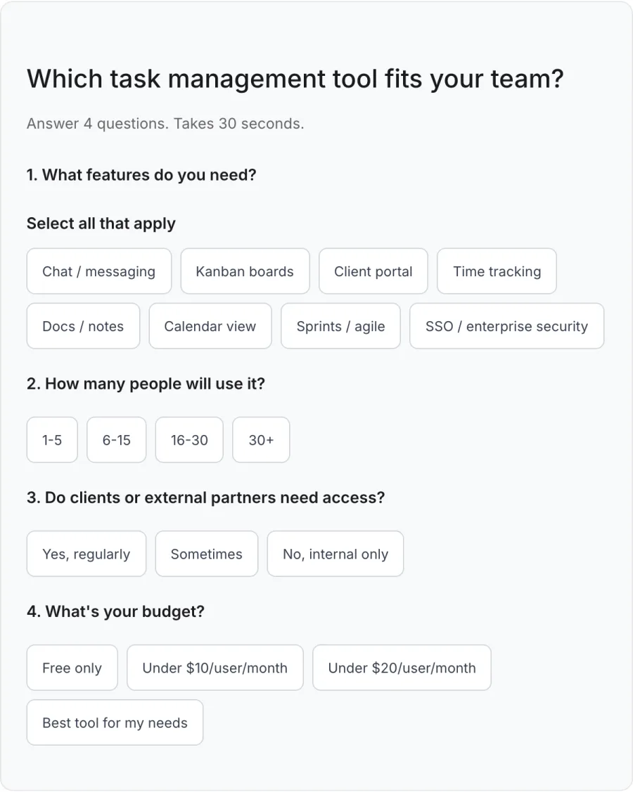
Not a quiz about which animal you are. The first real one sits on a page about task management tools, a category that has no shortage of them. Four questions, then a straight answer about which tool fits. Sometimes that answer is a competitor.
I know the kind of team Rock suits and the kind it does not, so the quiz says both. The honesty is the part I like. Readers who fit recognise themselves, and the ones who do not get pointed somewhere better than a page insisting they are the target customer. I did not know what to expect from it. Those competitor pages have grown a great deal since.
Below is the same quiz, running exactly as it does on the live article. Answer for your own team and see who it sends you to.
Which task management tool fits your team?
Answer 4 questions. Takes 30 seconds.
1. What features do you need?
Select all that apply
2. How many people will use it?
3. Do clients or external partners need access?
4. What’s your budget?
Start over
The quiz is doing funnel work in the wrong place on purpose. Deciding which tool fits normally happens further down: a trial, a spreadsheet of plans, a call with sales. Moving that decision onto the blog page hands it to the reader before anyone has asked for an email address.
Move the aha moment up the funnel
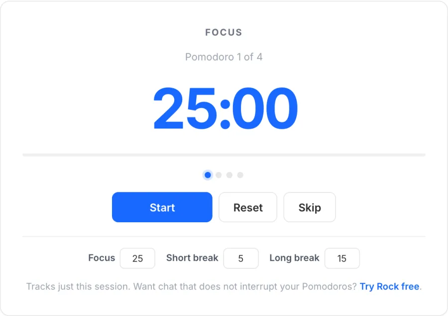
A recommendation is not the only thing worth moving up the funnel. Every product has a moment where it clicks. For a task tool it might be dragging a card into Done and getting a small burst of confetti. That hit of dopamine explains why a board helps a team faster than any paragraph about visibility and workflow.
None of that shows up in how a blog gets measured. A page gets graded on the visit and the conversion. Whether it is crawlable, whether an agent can cite it, whether the funnel is tight. Nothing on that list asks whether the person who landed got anything out of the two minutes they spent there.
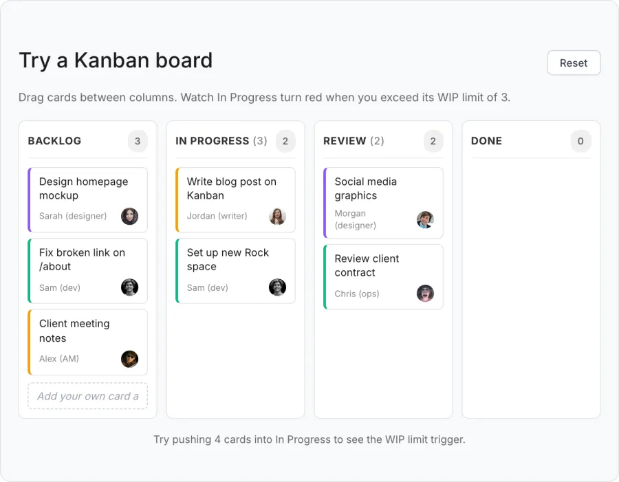
Here is that moment, live. Drag a card into Done, or push four into In Progress and watch the column object.
Try a Kanban board
Drag cards between columns. Watch In Progress turn red when you exceed its WIP limit of 3.
That took a few seconds and no signup, and the WIP limit taught itself the moment you tripped it. Normally that moment sits behind a form, an account and some setup, which means the people most likely to be convinced by it are the people who already committed. A widget on a blog page lets someone feel it before they have given you anything at all, and then sign up for the real thing already knowing why.
Moving the aha moment that far forward takes trusting your product a bit more, and letting people experience it earlier than the funnel would like.
Call it a gimmick
By now this post has put a product quiz and a kanban board in front of you, mid-article. That is exactly the kind of thing that gets called a gimmick. I do not mind the word.
Attention on these pages is short and getting shorter. If a widget helps five percent of readers understand the product faster, it has paid for itself. Build time has collapsed far enough that five percent clears the bar.
Widgets do ask more of the marketer, though. The widget has to look and behave like the thing you are selling, which takes a real grip on the product. A bulky widget with too much text and the wrong styling is worse than none at all. Now your company looks careless on its own blog.
That standard is also what stops you rolling one out on every page. A widget that does not answer the question the reader arrived with is decoration, and readers can spot it. The first pass from an agent arrives full of design tells that scream AI, so most of the half hour goes on getting it to stop looking generated.
A third of the people who see one use it
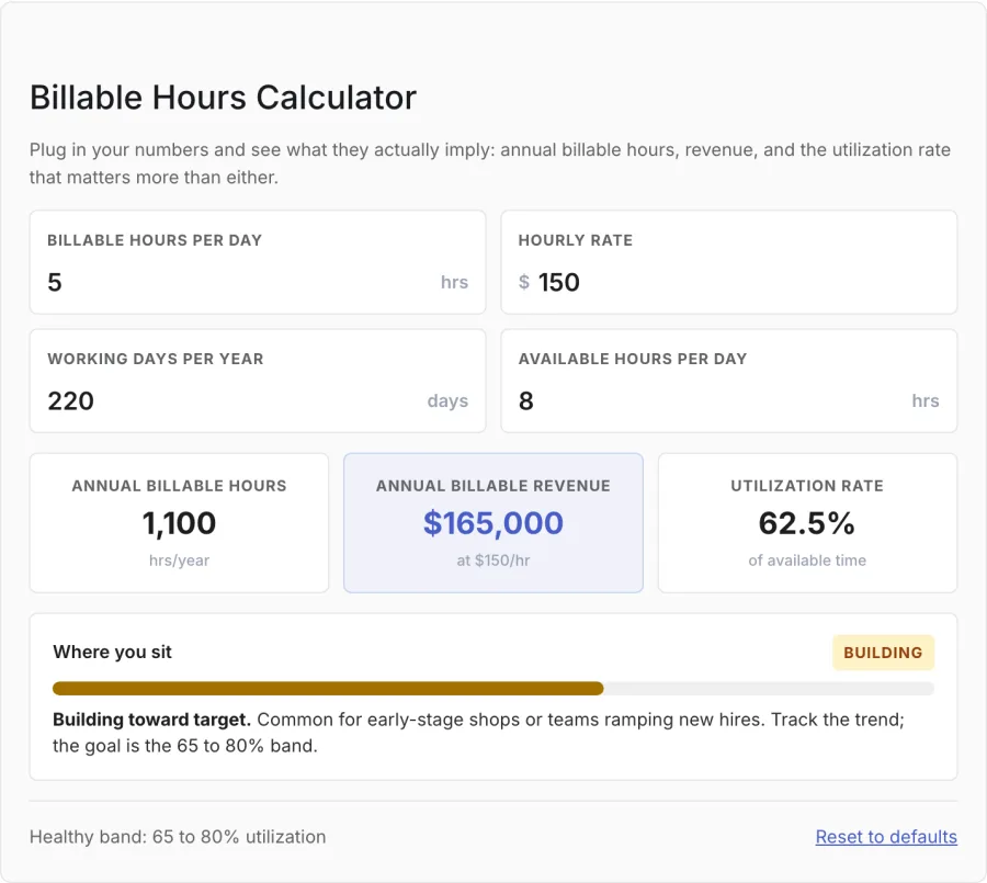
Rock’s blog gets its readers from search, people skimming for an answer. One in three who scroll a widget into view stop and use it, and on the best pages it is more than half.
The median first interaction comes 24 seconds after landing. That is not enough time to read past the opening paragraphs: people reach for the widget while they are still deciding whether to read at all.
The numbers from the event tracking:
Rock blog, PostHog events, 90 days to August 2026. Counts a widget as used on the first real interaction, so a reader who fills in six fields is counted once.
None of which replaces the writing. That still does the convincing. The format BuzzFeed needed an engineering team for in 2014 now costs half an hour with an agent, which puts it in the hands of whoever actually understands the product.
If you want to build one, I wrote down how I actually make these. Picking the format, the brief that starts it, and the twenty minutes afterwards that decide whether it looks generated.
These are all live on the blog where the work ships, if you would rather go and play with them first.